Brighton Veterinary Cardiology
Branding
Brighton Veterinary Cardiology provide experienced, local specialist care for pets and liaise directly with their owners. They diagnose and treat heart conditions in a range of different animals though predominantly cats and dogs.
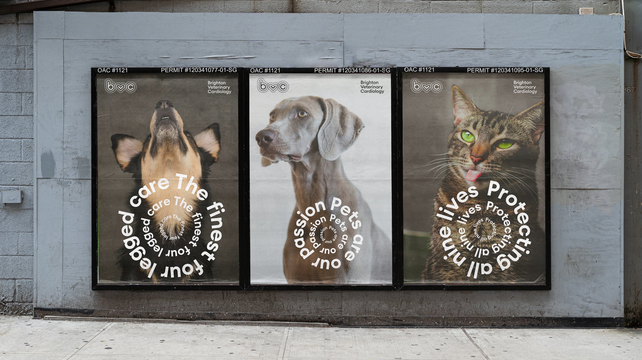
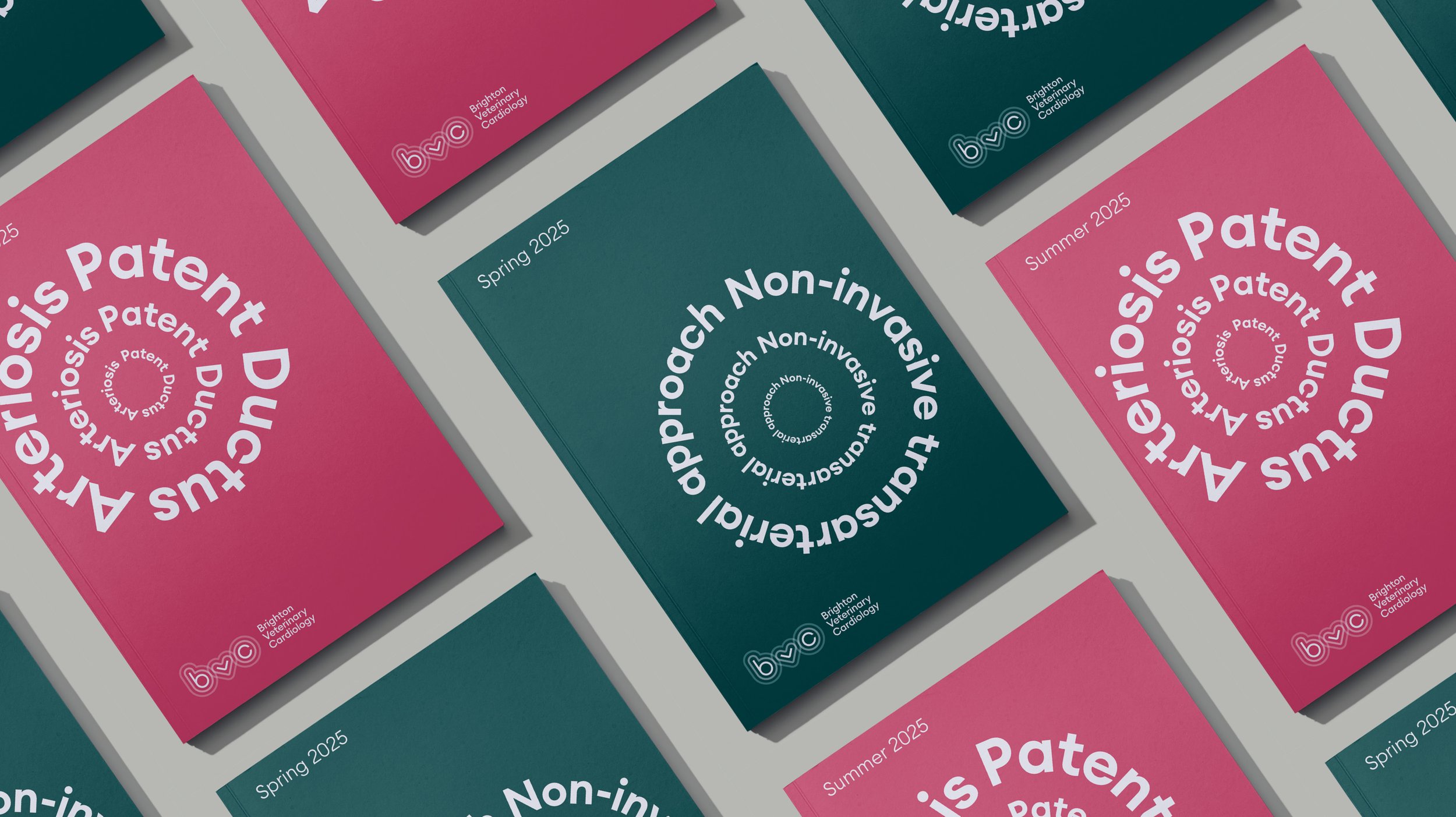
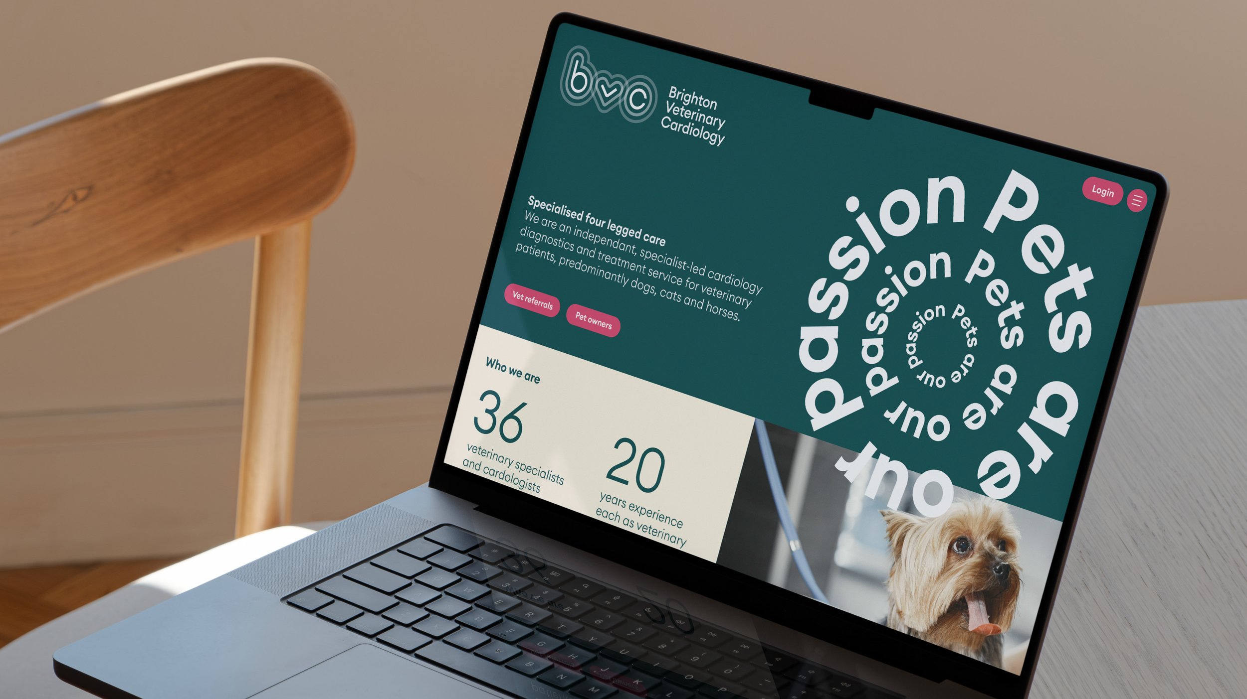
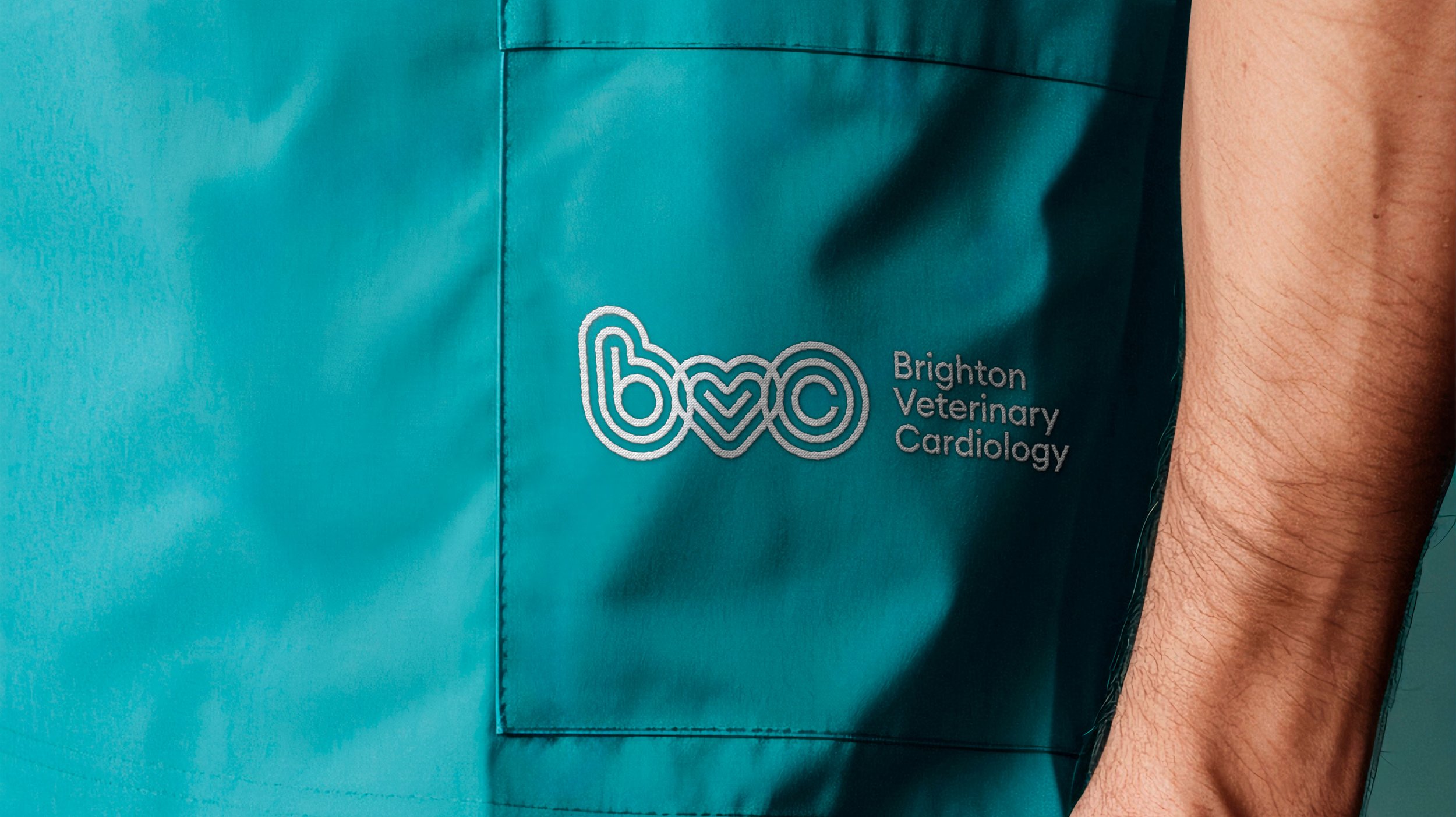
In a sector saturated with cliché imagery of hearts and pets paws it was important to design a solution that steered clear of these whilst still communicating the core of what this organisation represented.
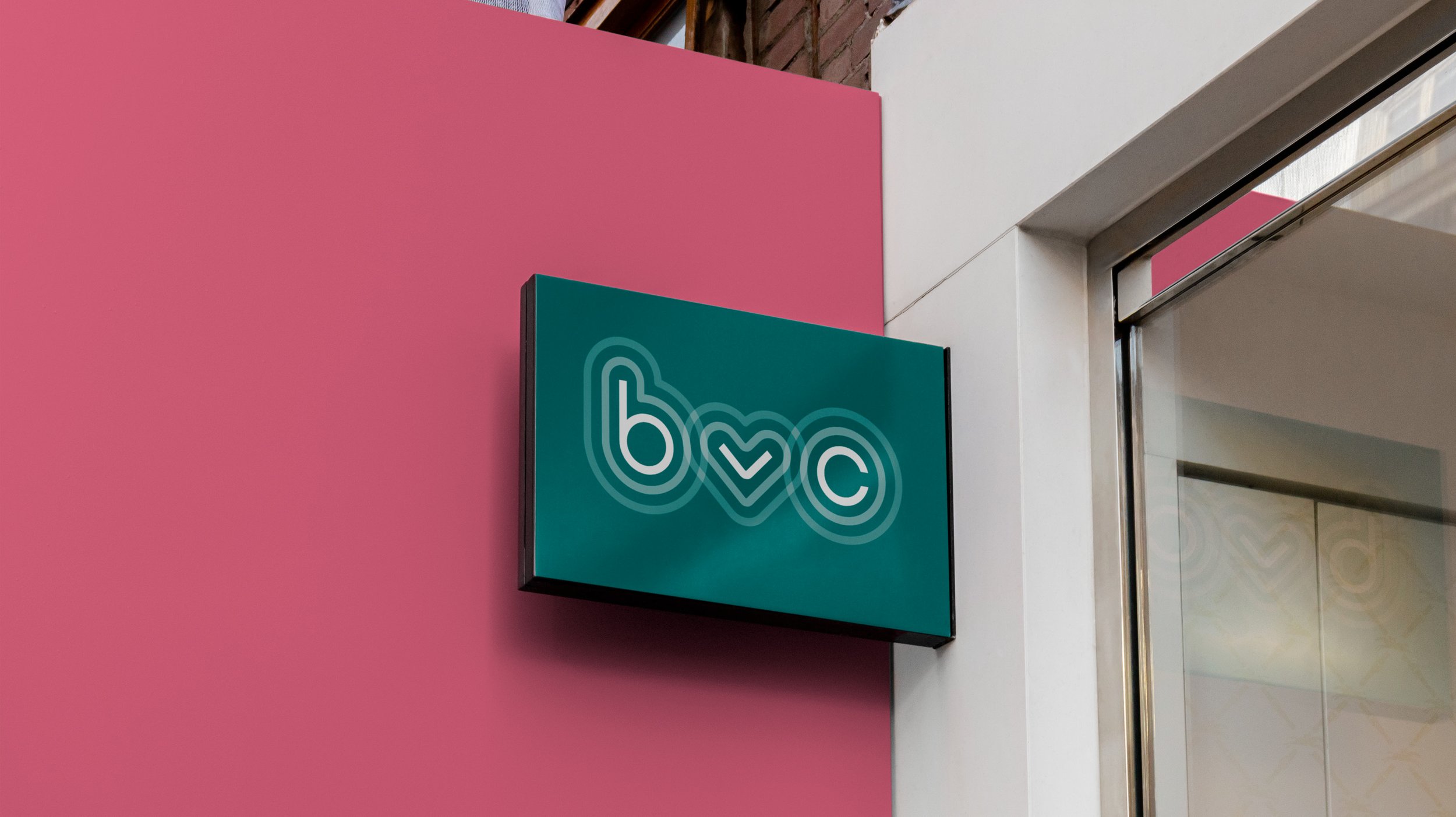
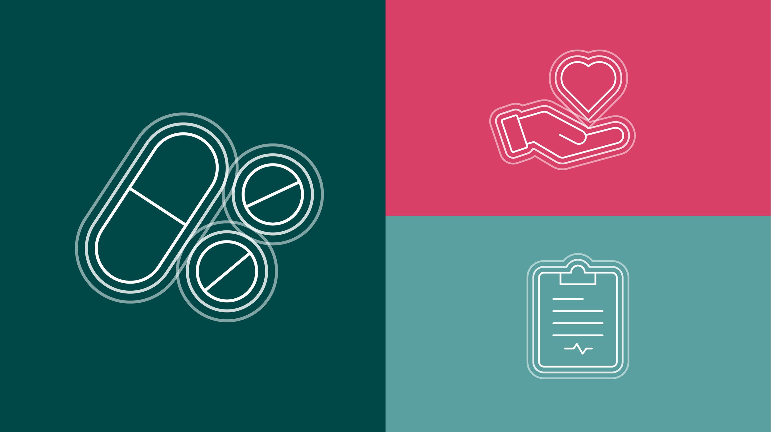
Our solution hinges around a simple idea of rippling shapes to represent a pulse or beating heart. This is expressed simply by echoing the lines outwardly of our bespoke lettering within the logotype and icons.
This concept can also be applied in a more expressive way to typography and headlines, typed on a circular shape by repeating them at larger sizes at even intervals.
The colour palette needed to not be too visceral and avoiding ‘blood red’ as this was also overused within the sector. The dark teal gives the branding a mature grounded feel to balance the more playful typography with the magenta/pink colour used as an accent colour.